Strong growth expected for a construction industry on the mend, but fragilities remains
Construction should grow at an average annual rate above 4% for the next four years, if forecasters at the Construction Products Association are right. That’s solid growth.
The forecasters upped their expectation for 2014 from 3.4% to 4.5%. But more importantly in my view, the mood of the forecasters was less vexed by downside risks that might blow their forecast off course.
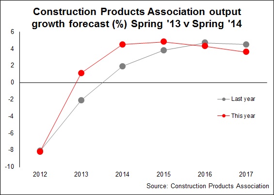 The top graph shows how much stronger the recovery seems now compared with a year ago.
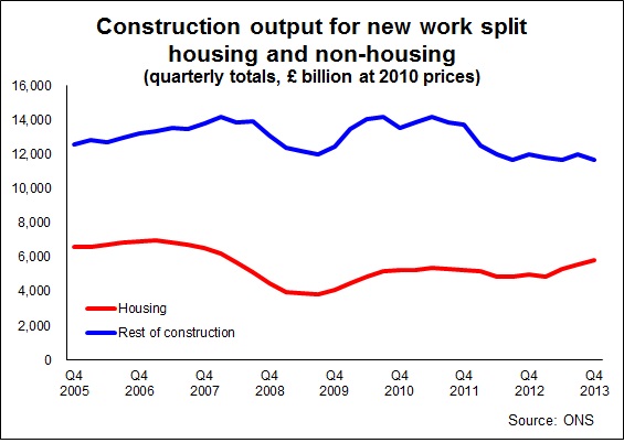
Before getting overexcited, note the second graph, drawn from ONS construction output data. It covers just new work, not repair and maintenance. It shows that construction if not for house building construction would have been stagnant or declining.
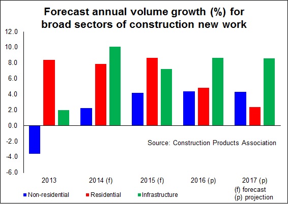
Happily CPA’s forecasters expect this to change. Infrastructure should be very buoyant over the next four years averaging growth above 8%. Mind you, the big risk the forecasters highlights is the Government’s ability to deliver its promises. If it fails infrastructure activity will look far less impressive.
Meanwhile, non-residential building work should growth more modestly, averaging a bit less than 4%.
Growth in repair and maintenance work is expected to average around 2% to 2.5% over the four years.
In isolation the overall growth rate seems impressive. But it will be 2017 when construction output returns to 2007 levels. And with a fairly fast growing population you’d expect strong growth in construction.
Trying to put the construction industry’s performance and prospects into perspective is tough, especially when the “firehose” of construction data is turned up and we are fed frequent daily reports offering often contradictory data and commentary.
The release of the CPA forecast follows a few days after the latest official output figures, which, perhaps ironically, suggested a slowdown in February.
In my book one month’s data in construction is too unreliable a basis too much analysis, especially as the figures are likely to be revised. Still analysts and commentators confidently put the fall down to bad weather. Well, there certainly was bad weather, and it probably impacted on construction. But it’s hard to call precisely what effect it had on the published figures compared with other bad weather we have about the same time every year.
Anyway, I thought I’d pull a few charts together, focusing primarily on new work, which hopefully provide some guidance above and beyond the CPA forecast.
The first is the Markit CIPS PMI index. Now I’ve included this because it gets a huge amount of attention from non-construction economists and commentators.
It’s useful, but widely misunderstood and its limitations are seldom taken into account. Put simply, it measures, with a few statistical tweaks, the balance between the number of firms seeing things going and those seeing things going down. It uses a scale of 0 to 100, with 50 as no growth. For our purposes I scaled it on an axis taking 50 as zero.
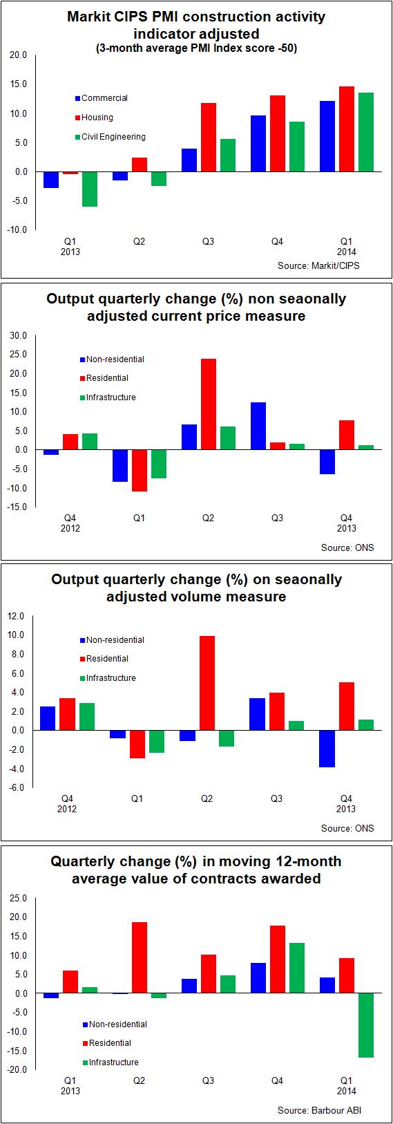 There are problems with types of indicator. They’re not volume measures so the line they plot doesn’t directly relate to levels of workload, which does catch some people out. It’s a measure of change and there’s a tendency for these indicators to exaggerate turning points. This can be very useful as it can provide an early warning signal.
But it also leads to nonsense interpretation by the unthinking or wilfully disingenuous (both are categories into which some politicians fall) who confuse a high reading with high output. In February this year the index hit 64.6 a level surpassed in only one month in the 2000s, when construction hit its peak.
When a politician suggests “construction activity” is back to 2007 levels, they are talking bollocks and you can often trace their comments back to a misinterpretation of this indicator.
The next two graphs measure recent changes in quarterly output of new work. I’ve shown these on a cash basis (current prices) that is not seasonally adjusted and as a volume measure where the statisticians have sought to adjust for both inflation and seasonality.
Things look a bit better on a current price basis as you see. And as most firms think in cash terms, certainly short term, this will explain some of the bullishness. What is very clear again is just how strong housing is compared with other sectors.
The final graph I’ve chosen is taken from Barbour ABI data, which will tend to emphasise new work over repair and maintenance. This shows the 12-month moving average value of contracts let by broad sectors. Taking this annualised measure will tend to smooth out seasonal effects and the lumpiness of contract data, but no account has been taken of inflation.
Here again we see the strength of housing relative to other sectors. But what also comes across is the volatility in the infrastructure sector.
So looking across this collection of data and the Construction Products Association forecast what do we see?
I suspect if you are not in housing you see what you expected. A lot of housing and some positive signs of growth with optimism on the rise.
If you are in housing you perhaps see an industry doing less well than you might have thought.
But we can also see that while the industry seems to be on the mend it is by no means booming. And there are definite areas that remain fragile.
Note: graphs 5 & 6 were replace after noticing a date error in the x-axis in the original