Housing policy: If the answers aren’t working maybe we need to be asking different questions
Progress exists because we ask questions. The right answer rests on asking the right question. Curiosity is king.
Say what you like, addressing questions builds knowledge, even if you don’t come up with an answer. But asking questions is not without pain. It can undermine what we hold to be true.
Still. No pain no gain.
Metaphorically armed with this array of aphorisms, I recently answered a call for presentations at the excitingly-named Consultative Committee on Construction Industry Statistics.
I promised more questions than answers. I fibbed. It was all questions and no answers.
But the opportunity to tease the minds of statistically-literate and interested construction industry thinkers was far too tempting. I had a question that had bugged me increasingly for best part of a decade to which I have yet to find answers.
Putting together a presentation obliged me to collate bits of data. Here are some edited highlights, mainly charts.
The initial question is this:
Why is it that, since the mid to late 1970s, homes built have closely tracked residential property transactions at a ratio of around 1:10?
It may be that there is a body of work out there on the subject, but I haven’t found it.
Anyway, here are two graphs you may have seen before. The first shows the relationship between annual private housing completions and residential transactions. The inclusion of non-market completions is there for reference and not to suggest a cause. The second, preferred and provided by Neal Hudson of Savills, shows the four-quarter moving total of private housing starts along with residential transactions. It’s a closer relationship.
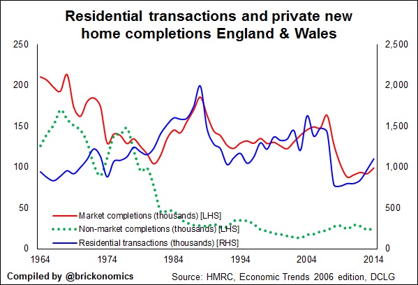

On these data new private homes have held pretty consistently a 10% share of the English housing market.
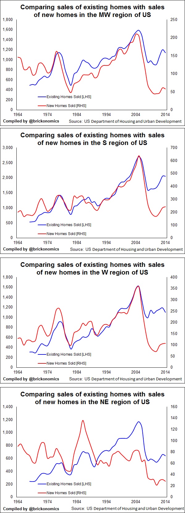
Interestingly the pattern holds fairly true across the regions, although in some regions new-build takes a larger share of the market. In the East Midlands for instance. Below is a selection of graphs showing regional data.
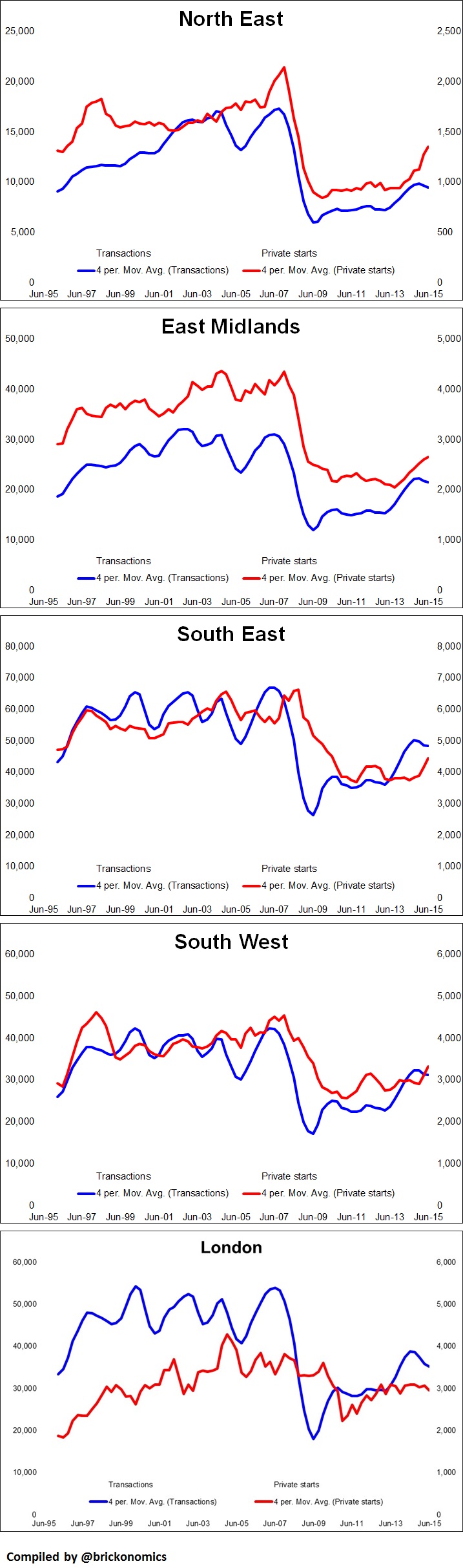
The relationship, as you can see, does not however seem to hold in London.
What has puzzled me for a long while is why more work hasn’t been done on exploring the link. I can’t say if it is true, but clearly if transactions are a key factor in determining how many homes are built this has massive implications for policy – need I mention that stamp duty is a transaction tax.
I have found mention of it. Here’s a chart from a report in 2003.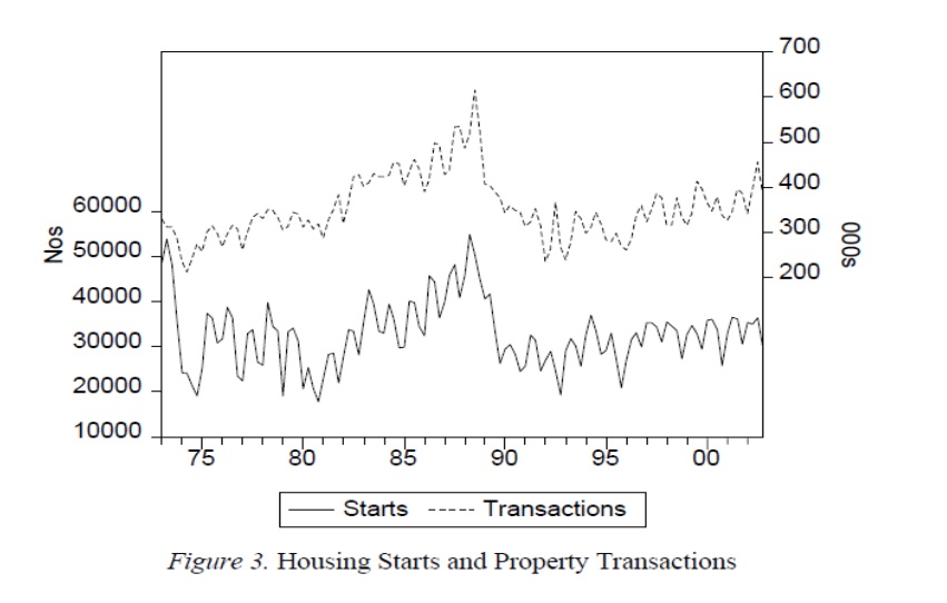
It was prepared by Geoff Meen of the University of Reading for the Barker Review of Housing Supply.
It makes for fascinating reading. I recommend it, along with a more recent paper Housing Supply Revisited (2011) by Michael Ball, Jennifer Goody, Geoff Mean and Andi Nygaard.
But why is not more work being done to understand what amount to two very important questions:
- What causes house building to respond to transactions?
- Why has a fairly stable ratio between existing and new home sales formed over the past 40 years?
Perhaps there is work going on but it is fairly hidden from view.
I would certainly like to know more about what international data can tell us? For instance, is this a particular phenomenon to the UK?
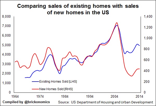
Recently Neal Hudson (he shares a fascination with this relationship) sent me a graph showing a similar relationship had held in the US from 1994 to 2004. Over that period across the nation new homes held a fairly consistent market share of about 15%. I downloaded a longer time series.
This is what it showed. From the late 1970s for almost 30 years, with the exception of a couple of blips, new homes accounted for about 15% of all home sales. It will shock no one that since the Great Recession, which led to a spate of foreclosures, the new homes market share has fallen. Although as we see it has responded to the rise in overall sales.
If we split the data into four broad regions we see that this relationship holds, with the exception of in the significantly more urbanised NE.
The apparent coincidence of experience either side of the Atlantic seems well worth exploring.
For me, just to satisfy curiosity, there is a strong case for exploring this relationship more deeply.
However, there is a far more pressing reason as we see in the graph below.
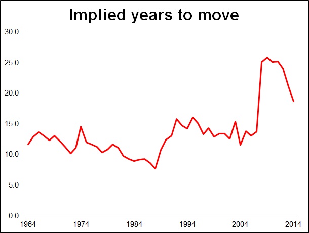
If new private homes are tied in some way to transactions we are in for a nasty shock. Because, as things stand housing turnover is declining. There is a host of reasons for this, not least demographic. Data suggests that older homeowners (the ones who own an increasing share of owner-occupied homes) are less likely to move than younger homeowners.
Now it may be that the relationship has formed by chance. It may not be important. But then again.
While asking awkward questions may be uncomfortable, not asking them can prove very painful indeed in the long run.