Reasons to be cautious over the latest construction output data
Last Friday the Office for National Statistics released final quarter data for construction output in 2014. It put growth for the year at 7.4%.
This, according to the official record, followed slightly anaemic growth in 2013 of 0.4%. The suggestion from these figures is that construction took off rapidly in 2014. 7.4% growth is pretty tasty.
But should we believe this version of recent history?
My advice would be no.
I suspect when the figures are settled later this year we will see a different pattern. Say growth anywhere up to 3% for 2013 and growth between say 4% and 6% for 2014.
This is not just a punt. There are good reasons to suspect this.
I can’t say I fully understand what’s going on, but clues can be found in tables 2a, 2b, 4 and 9a of the associated reference tables for the November and December data.
So, here’s my take.
Table 9a shows the implied output price indicator – a series of coefficients that are there to show the difference between the data unadjusted for inflation and data adjusted for inflation (tables 4 and 2b). This important adjustment means we can assess the industry output both in cash terms and equivalent volume terms.
The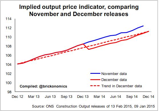 graph shows the path of the indicator published in the latest release (for December) compared with the path in the release published a month earlier.
We see a strange dislocation in the latest data. Rather than the data suggesting a steady pattern of inflation we have a sudden drop to apparent lower inflation in January 2014. This clearly isn’t how inflation works, unless for instance there’s a sales tax increase or the like. Even then it’s unlikely to be that stark a jump.
Look then at the revisions to table 2b (the non-seasonally adjusted volume measure). Almost £2 billion has been added to the period January to November 2013 in the latest release compared with the previous. The upward revisions to table 4 (the non-seasonally adjusted current-price/cash measure) is just £384 million, if my maths is correct.
What is more significant in this argument is that there have been no upward revisions to the data for 2013 or earlier.
The upshot is that statistical changes to 2014 data have raised the estimated level of work done. But no revisions have been made to 2013.
So, why the revisions?
There are two possible explanations that pop into my mind for a major change in the implied output price indicator. Firstly there has been a change in the estimate of the inflation rate applied to construction output. Second there has been a change in the structure of the data that has shifted the implied inflation.
But why were revisions made to 2014 and not 2013, leaving an uncomfortable jump in the data in January?
The reason here is likely to be that the 2013 data is fixed, because it is tied to the national accounts (The Blue Book, which I understand to be locked until June).
This would mean adjustments can be made to the 2014 data as more and better information is available, but this new information cannot be applied to 2013 until the Blue Book is reopened.
The trouble is we now have an apparent bizarre set of numbers. The suspicion is that the inflation adjustment (real or implied) fixed into the 2013 data is too high.
What does this mean?
If we were to assume the data will eventually run smoothly across the two years (let’s assume the implied inflation comes in closer to the dotted red line in the graph) the effect would be to raise the constant price output figure for 2013. All other things being equal, this would do two things. Growth in 2013 would rise while growth in 2014 would fall.
Ultimately we end up at the same place, it’s just the route is a little smoother.
So why does it matter?
The truth is for most people it isn’t going matter a jot. But for people who analyse how the industry is performing it has profound implications. We rely on history to provide a clue as to what is happening and what we might reasonably expect to happen in the future.
The statistics are vital tools to help plan better and set policy better. Well that’s the theory, one to which I subscribe.