Painful lessons in the need for common sense and curiosity when dealing with statistics
Last summer Jo Smit of Building for Change asked me to look at a document produced by the Office of National Statistics. It seemed to show energy consumption dropping 25% between 2005 and 2011.
The document and some press coverage seemed happy to put this huge drop largely down to energy efficiency.
As a big supporter of energy efficiency Jo would naturally be delighted by such findings, if they were true. But being smart and questioning she realised that it would be a near fantasy to think that within six years energy efficiency could reduce household usage by this amount.
I agreed it seemed silly. We decided to look into it as the basis of an article for the Retrofit Briefing newsletter.
In the finished article, I admit my first point was pedantic. But it matters to me how people see decimal places.
Why did the statistician put a figure of 24.7% on the finding rather than 25%? Could he possibly be so certain of the figure to warrant that degree of accuracy? Did that decimal point really add meaning?
Hell no.
But among a catalogue of concerns one finding in particular caught my attention. The study suggested, even after weather correction, that there was an extraordinarily weird spread of household energy consumption between regions.
Why would households in the East Midlands of all place use on average 70% more energy than those in the South West and a third more than in the West Midlands? (The top graph is taken from the original report)
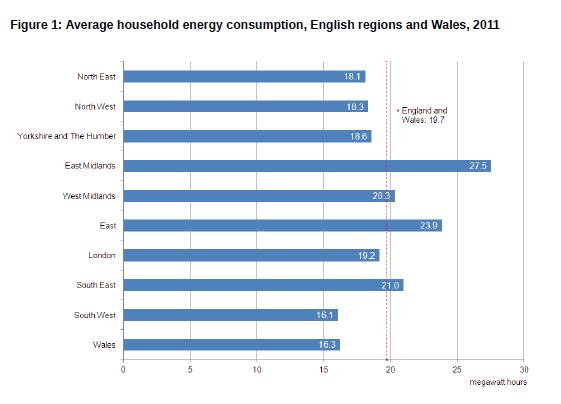 Indeed even more extraordinary was the finding that all of the top 10 regions for household energy consumption were in the East Midlands.
Such findings, if accurate, should have been the headline of the story.
They could point to a fantastic series of energy efficiency policy measures. Encourage people in the East Midlands behave differently. Don’t build homes like they do in the East Midlands. Don’t have an energy pricing policy like they do in the East Midlands.
But no, little was made of these oddities.
This potential PR miss was in happy hindsight very fortunate for ONS. We now know there was a methodological error and the work was updated in February 2014.
Of course there was a methodological error.
Had it not occurred to check a few basics here? Didn’t the statistics clang the alarm bell?
For example, I had a quick peek at the average SAP ratings for the supposedly top 10 most-energy-gobbling boroughs in the research. They were pretty average, so it didn’t appear to be housing stock issue.
Were we looking at high-rolling, sauna-loving, window-opening, sun-bed fetishists in Rutland having high-energy parties on a regular basis?
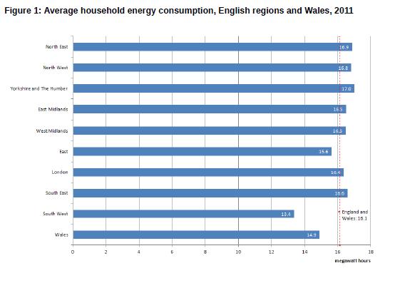 Well actually, no. (The bottom graph shows the corrected outputs posted here)
It turns out the most lavish users were in South Bucks and a list of other very wealthy boroughs.
Ah, now that makes a bit more sense.
There are in my view other problems with the research which I’ll not bore you with, such as the choice of datum points on a timeline.
The lesson I would draw here is that not having a nose for obviously weird findings and not questioning outliers can be dangerous. It should be instinctive, along with not implying accuracy that isn’t there.
My aim is not to crow, nor to pillory the researcher. Hell’s teeth we all make mistakes (Professors Reinhart and Rogoff and their excel cock up come to mind) and there are plenty I would prefer to forget.
What bothers me now and bothered me then was why no one else looking at the study appears to have been curious enough to question such bizarre findings.
For the record the overall decrease in average household energy consumption in England and Wales was revised down to 22.3%. And I am still suspicious.
It seems, at first glance, to be at significant variance with the 17% drop in average energy used per household between 2002 and 2012 quoted in the recent ONS report on household energy spending in the UK.
And as for the explanations for the drop provided in the earlier study, the less said the better.
This was not the finest hour for the ONS, which in many ways I hold in high regard.