Is it time for housing policy to pay more heed to the costs and the benefits of location?
Location, location, location. They may be the oldest three rules in the property world. But do we need to take those rules more seriously in housing policy?
When I owned a flat in Islington, London, in the 1990s I was surprised just how little the insurance cover was for the building relative to the potential sale price. It covered little more than the value of any one of the four flats into which the building was divided.
Even back then you could rebuild all four flats for not much more than the price paid for just one. That meant that the land on which the building stood, or more precisely the location, accounted for far more than half the sale price.
I knew even then that it wasn’t so much the land as the location that added the value. I had a garden flat and it was worth not that much more than those above me with no access to outdoor space. Anyway that was London a decade and more ago and I guess the proportion of the value attributable to location will have risen sharply since then.
 Perhaps it should have been obvious, but I recall at the time it seemed absurd. It would be more absurd now that the difference between house prices and the cost to build has widened greatly.
So just how much of an average UK house price is down to location? How has this changed in recent years?
I have put together a series of graphs that I think tell an interesting story. From just over a quarter of the sale price of a home in the late 1950s, location now accounts for close on 70%.
You don’t have to be property professional to recognise that this has big implications for housing policy. And if you think about it for a few more minutes it’s pretty clear it has huge implications for regional, economic and industrial policy too.
Basically what these figures show is that we pay an ever increasing amount of money to be near things. Location is what matters and increasingly so it seems. After all it is not the intrinsic value of the land that makes London attractive.
But I guess we always knew this. So without meandering too much more here’s how we get to these figures.
In these things you can only ever get crude pointers. The price people pay for a house depends on a huge number of things and how they value each element within the package that is a home. It is also unclear exactly how tax is factored in, given that stamp duty is applied to homes sold and they sell at different frequencies.
Still, I decided to have a stab, albeit a fairly crude one. I have sought here to look at national statistics and see what value the nation ascribes to its housing stock, both in total and as buildings.
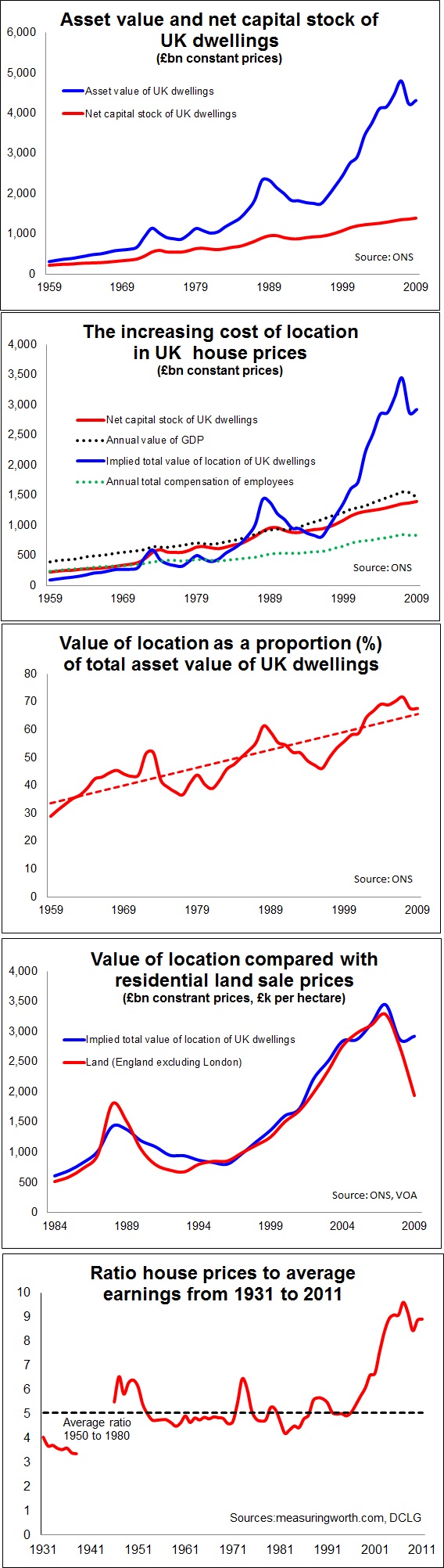
Thanks to help from the ONS I have a fairly reliable back series to 1957 of what has sat on the UK national balance sheet for dwellings. There’s a slight discontinuity in the figures, but it’s not significant at the level of analysis we’ll do here. ONS also kindly sent me various series which provided the net and gross capital stock of all dwellings, which is broadly the asset value excluding land.
For those who bother about these things, I decided to compare them at current value to avoid any issues related to the application of different deflators in the volume data (asking the ONS for details and explanations of the deflators used seemed to be pushing it a bit, though I am sure they would have obliged).
The comparison made, I then applied a GDP deflator across both to bring the past broadly into line with the present in terms of relative prices.
The results you can see in the graphs.
The top one shows the asset value (the sum of assumed market prices) in blue and the net capital stock (the building value taking into account depreciation) in red. Naturally the stock has grown over time and houses are of better quality, many having been refurbished and modernised, so we would expect growth in net capital stock. But the overall value of homes in the UK has rocketed.
The second graph maps the building value of UK homes and the difference between that and the total asset value. This gives as the blue line an implied value for the location (land if you like). To get a view of scale I have charted the annual values of GDP and compensation of employees. Something wild seems to have happened in the mid 1990s.
The third graph shows the implied value of location as a proportion of the total value of dwellings. This gives us an approximation of the average amount of the sale price of a house that can be put down to location. This is where we see the trend most clearly. I’m not totally sure why I put a straight trend line on the chart as it implies at the current rate of growth in 50 years the value of a house will be solely down to location. Anyway it was for a visual aid.
Just to test the land/location thing a bit more I tracked the land values data from the Valuations Office Agency for England excluding London against the implied value of location. They are different measures but the tracking was pretty convincing.
And in case you think it is just down to London, land values since the mid 1990s have risen in England as a whole to about the same degree as in London, but obviously London land prices are higher.
This does not mean that London is or isn’t helping to drive the effect, it’s just we’d have to do much closer analysis to know what impact it is having. Also there have been some alterations to the data collection that might understate the impact of some of the more exotically priced London locations.
Now the final graph is an old one I have on the stocks. It shows very crudely the house prices to earnings ratio from the 1930s. Again something wild seems to have occurred in the mid 1990s.
It seems rather extreme until you actually examine in a bit more detail what people were earning and how much a house cost at each point.
I’ve put together a table of the average annual earnings of a building worker and the average house price for each decade from 1930 to 2010. This comes from various sources (including Mitchell’s British Historical Statistics and ONS), so I don’t pretend this is academically rigorous, but it is pretty indicative. For 1940 I have used 1938 data for obvious reasons.
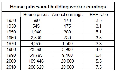 What it tells us is that in the 1930s you could buy a house for between three and four times a building worker’s annual income. In 2010 it took seven and a half builder’s annual incomes to buy a house. And in reality the house being bought in 2010 would probably be smaller and have far less garden.
But land prices in the 1930 could be as low as 2% of the sale price. Basically a house in the 1930s was the price paid for the sweat of labour, the application of skills, the costs of material and the builder’s profit.
From the data above, unharnessed, one can start drawing some pretty profound conclusions. I’ll hold back at this point, but time permitting it is worth looking at why we have to take far more account of location as a concept when we talk about housing.
But there are a couple of thoughts, although not particularly original, that come into my head and are perhaps worth noting here.
House prices are not related simply to the cost to create somewhere to live. And, land in this context appears to get most of its value from what everyone around it does and did. It is perhaps odd, but yet instructive, to think that its value may have been in large part created by incidental actions of people long since dead.