Figures show we are just not building enough homes. It is that simple.
The latest official house building statistics to emerge underline the massive task ahead for the Government if it is to meet its promise of boosting English house building rates to a level above that achieved before the recession.
It was in September 2010 that Grant Shapps ambitiously announced this “Gold Standard” against which he, as housing minister, would be judged.
It looked a tricky task then. It looks highly improbable now.
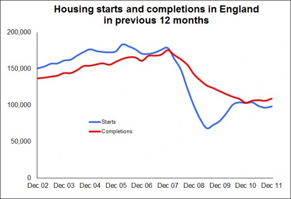
 The pre-recession peak for new home completions in England stands at 175,550. The number completed in 2011 was 109,020.
That means the task equates to an increase of 61% in just over three years. It suggests we need an unflinching 15% plus annual growth rate in new home completions over those three years or so in England to hit the target.
It was 1964 when England last saw an annual increase of 15% in house building. We have not seen the sustained growth needed to meet the “Gold Standard” for about 60 years, when the UK economy was emerging from the ravages of war.

Furthermore, growth then was underpinned by huge public sector investment and a belief in the political imperative of building homes for heroes.
Sadly today the political and economic context seems to be stacked against growth in house building rather than in favour.
A year ago I wrote a blog considering whether we were condemned to low levels of house building. If anything my concerns have increased since the piece was written.
Looking to the data released yesterday, the graphs show the devastation to house building numbers caused by the recession. In this context it seems clear that the regular inter-party political spat over which Government saw how many homes built over what period is a pointless distraction. The problems run far deeper.
What I find particularly worrying is that Grant Shapps finds any encouragement in these figures.
The picture that any independent observer would see is one of an industry that has rebased its production to a level of building just above half that achieved before the recession.
And don’t forget that before the recession the consensus was that build rates were far too low to support the nation’s need.
At this point it’s worth noting that the housing strategy relies on the performance of the private sector. Therefore market forces will be the dominant determinants of growth.

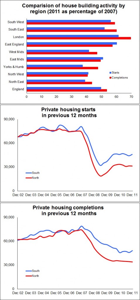
So it is interesting if not unexpected that, as we look at the data in a bit more detail, we see that the “rebasing” of production is not even across the country. As the regional graphs show the drop in production is far less marked in the South than in the North.
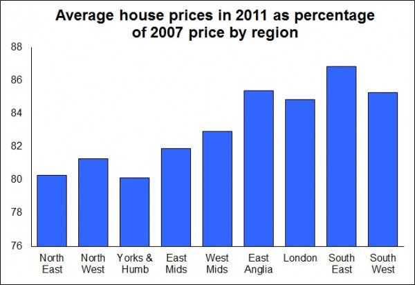
What’s also interesting to note is that the stronger regions for production are the regions where prices have remained strongest, as the graph showing the Halifax measure of average house prices shows. This hardly comes as a surprise given the relationship between effective demand and house prices.
But, when we consider what this data might suggest, it all seems to lead us to questioning the lazy and commonplace assumption that the problems with the housing market and house building lie predominantly with mortgage availability and affordability.

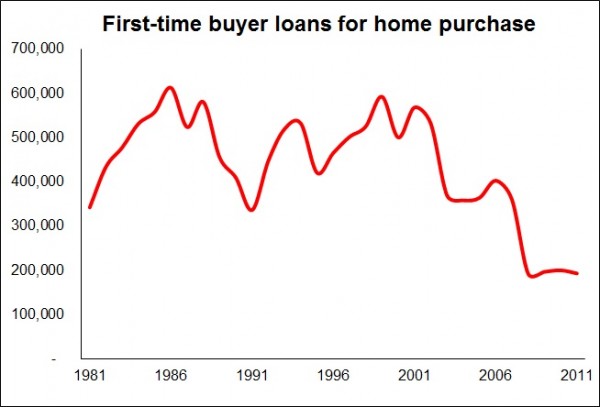
These may well be restricting factors, but it is unhelpful to assume they are the core problems, if only because it appears to ignore the evidence. The graph using Council of Mortgage Lenders data shows that the slump in first-time buyers can be tracked back to 1999. Even the insane mortgage lending of the mid 2000s failed to revive numbers significantly and managed only to halt further falls.
Also, if we look at the data, admittedly with the limitation that it is aggregated, its not unreasonable to suggest that if house prices in the North have been more aggressively revalued they should be both more affordable and represent less of a risk to mortgage lenders.
Naturally the arguments are significantly more complicated, but you get my drift I hope.
What’s also worth noting about the relative regional performances is that the pattern suggests the task ahead for this Government is even harder than the aggregate figures for England suggest.
The data clearly indicate that the supply is following market demand. Again, it is not a surprise that this demand is within the regions where constraints on growth have historically been greatest – in London and the South of England.
But to build a strategy for growth in overall housing numbers on the performance in the most constrained regions seems, to me at least, risky.
Given the current low build rates, there will be sufficient permissioned land and a number of stalled projects within these “hotter” regions to service growth from historically low levels for a few years.
But it is questionable whether this strategy is sustainable in the longer term.
The inbuilt bias within the New Homes Bonus that financially favours development in the wealthier areas of England should provide some support to growth in the commercially more attractive regions. Naturally this incentive scheme rests in the longer term on the ability of the revamped planning regime to deliver sufficient land in those more constrained regions. The efficacy of the new planning system has yet to be proven.
But if the aggregate numbers are to improve to the levels promised by Shapps, in simple practical terms it would seem there will also need to be significant growth in the commercially less attractive regions.
The more you look at the data the more worrying it is, if you take the view that we need to be building more homes and we need to be building them now.
One thought on “Figures show we are just not building enough homes. It is that simple.”
We are building to many houses,
we cannot feed our population with the land we have now.
Rather than building houses, stop importing people, and encourage smaller families.
This will go towards solving many other problems as well.
Comments are closed.