Are we condemned to low levels of house building?
Research released this week by the think tank ippr painted a gloomy picture of house shortages in England growing disturbingly in the years to 2025, by which time it reckons we could have demand outstripping supply by 750,000 homes.
It’s a stab at trying to predict what might happen and there will always be problems with research of this kind. It is, for instance, not inconceivable that if Britain’s economy becomes less attractive we may see a significant rise in emigration as we did in the 1970s. That led to net outward migration.
Leaving such issues to one side, one aspect in particular caught my eye and is worthy of comment. It bases the 750,000 number on the rate of stock increase being 160,000 a year – the average over the past two decades. Last year saw 129,000.
But will we increase stock that much? Plenty of people fear it will be a long time before we build enough homes to boost stocks that much annually. Indeed, house builders have rebased their businesses to build far fewer homes.
There are many plausible arguments to suggest why we may be trapped in a low-build period. Here’s one interpretation of why we may have condemned ourselves to a low-build future for some years hence.
Naturally, this is just speculation based mainly on correlations, rather than researched causations. And it starts from the assumption that the driving force in the next few years behind build levels will come from the private sector and assumes no rapid collapse in house prices.
Let’s start with a graph that in many ways seems to sum up the recent history of the housing market.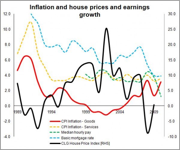
The graph shows (1) CPI inflation in goods (increasingly influenced by international markets), (2) CPI inflation in services (largely home grown), (3) the basic mortgage rate (courtesy Council of Mortgage Lenders, this doesn’t take account of offers such as the silly deals available in the mid 2000s), (4) data on inflation in median hourly pay (taken from nomis, ONS Crown Copyright Reserved), and (5) house price inflation as measured by the Communities Department.
There are various pertinent things.
Firstly, there appears to be an extremely close correlation between CPI inflation in services and median hourly pay in recent years. That’s not totally surprising as services are in great part delivered locally and by people.
Secondly, the graph illustrates how the period of low inflation and, indeed, deflation in goods corresponds rather neatly with the swelling of house prices. Indeed if you wanted to push it you’d say there was almost an inverse relationship between the two.
Thirdly, the graph seems to support the view of many economic commentators that the age of cheapening goods has past and we should now expect higher inflation in goods and for the inflation rate of goods to be more volatile. Further the period from 1995 to 2008 (broadly what is described as the NICE decade) saw a significant divergence in the path of the inflation rates for goods and services (the China effect, if you like).
Fourthly, deflation in the CPI basket of goods corresponds with a noticeable drop in the basic mortgage rate and the shift from deflation to inflation in goods corresponds with a rise in the basic mortgage rate – until of course all hell breaks loose and we are hit by the credit crunch.
What the graph doesn’t show is how the CPI basket of goods and services has changed over the period. In 1990 goods accounted for about 70% of the basket, now goods account for 56%. So inflation in services is a bigger determinant of the headline CPI rate.
So how does this relate to house building?
Put simply, it all comes down to house prices. If things are much more expensive, fewer people can afford them, however smart you might be at financially engineering models of purchase.
In 2004 Kate Barker noted in her review: “Affordability has worsened between cycles. In 2002 only 37% of new households could afford to buy a property compared to 46% in the late 1980s.”
Between 2002 and 2010 median hourly pay rose 29% and house prices (using DCLG figures) were up 54%, having risen from 2002 Q4 prices to the peak of 2007 Q3 by 145%. So if 2002 house prices were a worry back in 2004, what does that say about where they stand now?
We can see from the graph below that fewer than 200,000 mortgages were made to first-time buyers in 2010, according to the Council of Mortgage Lenders. This compares with almost 600,000 in 1999. The first-time-buyer decline long pre-dates the credit crunch, with a sharp decline in numbers in 2003 after house prices leapt by a quarter in 2002.
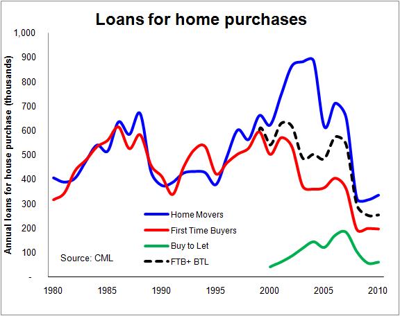
Indeed this is about the period when the buy-to-let market started to kick in a substantial way. If we add the number of house purchase loans made to buy-to-let investors to those of first-time buyers (the dotted black line) we see a fairly even pattern of loans up to the credit crunch.
It would, however, be a leap to claim that the buy-to-letters necessarily crowded out first-time buyers, but viewed from the perspective of the house builder or developer, this rise of the investor buyer will have eased many of their concerns over the sharply falling number of first-time buyers.
But this is just one section of the housing market that has been constrained from transacting. I have written before about the plight of the first-time mover. Rising house prices have, predictably, made it harder to buy into housing and harder for new entrants to trade up.
We all have a vague view of how house prices got out of hand.
Simply put, globalisation brought us cheap goods and cheap money, meaning low inflation, low interest rates and a lowering of integrity applied to the lending, because there was lots of money in search of a home, or home loans should I say.
Added to that we now know was the supercharging effect provided by the shenanigans of the global financial engineering industry with its bewildering array of tools such as collateralised debt obligations, credit default swaps, mortgage-backed bond securities and special purpose vehicles.
Meanwhile, it was all smiles because we were all getting richer (well on average) in a way that we were not accustomed to because our wages were going up roughly in line with services inflation, which had to be allowed to run ahead of the general inflation target to compensate for deflation in goods.
That’s a simplification, but it’ll do.
But what the graph below shows is the apparent reversal of much of the economic climaet that allowed house prices to swell. The days of cheap goods providing an easy route to rising living standards appear over, if the trends within this graph hold in the future.
What it doesn’t show is that we now have to pay the tab for the bout of extravagance we (some) have just had. But it does suggest that we are set worse to pay off that tab.
As goods inflation contributes more to the rise in overall CPI inflation – as it probably will – it is not unreasonable to expect significant downward pressure being applied to the domestic wage bill to suppress the services element of inflation. Indeed this is already in train with rises in median wages running below CPI inflation.
So, it is not unreasonable to assume that over the next few years median man and median woman are going to get poorer, or at least not get richer as fast.
This will profoundly impact on the housing market as so much of the psychology of home buying in recent years has been built on an expectation of increasing real earnings.
To get a better feel for that real world, let’s take an example of a median man as a sole breadwinner within a family of four with two young children.
Let’s take an average (median) male earner working in Gloucester (picked at random) and looking to buy an averagely (median) priced home in the district on a 100% repayment mortgage taken over 25 years. His wife does not go out to work and they have two children under 11. In 2000 the mortgage payments would have taken 33% of the family’s take home pay plus child benefit.
In 2007 the same deal would take a painful 49% of the income even though the average mortgage rate had dropped from 7.09% to 5.79%. But with the mortgage rate falling to 3.71% in 2009 the proportion of income dropped to 35%.
However, if rates returned to 2000 levels to buy the same house in 2009 would again take about 49% of the income of our family in Gloucester just to cover the mortgage, which would leave the family about £241 a week to live on.
This pattern holds for most districts across England and I have put together a table (see the appendix at the end) of the effects of changing house prices, earnings and mortgage payments for a few districts, based on interest-only mortgages for simplicity.
What we see is that at a fairly typical mortgage rate for recent times of 7% average households would probably struggle to afford entry into the housing market even if the current loan-to-value hurdles were eased.
This suggests that new entrants to the housing market may well be constrained, reducing the potential effective demand.
Naturally you might conclude that this would lead to a fall in house prices. But it isn’t quite that simple. While there may be a strong argument for a long-term readjustment, short-term falls require sellers to drop prices – if they are not forced to they tend to be reluctant to sell below their aspirations.
As things stand, there’s little to force sales, particularly where homeowners have been in the market for some while and have built significant equity.
If this holds, supply (homes up for sale) may follow demand (willing and able buyers) down the curve leaving prices fairly stable. We have already seen this response following the house price collapse in 2008.
The net effect is a decline in transactions, or, given that they are so low already, transactions might fail to bounce back smartly. This is where the whole thing comes back to house building.
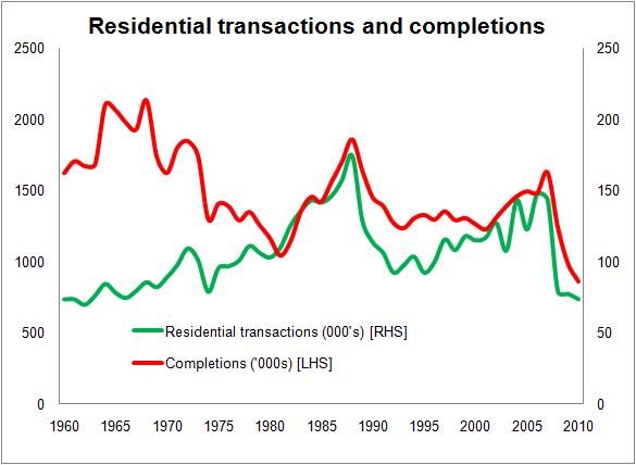
A strong relationship between residential property transactions and housing starts was highlighted in research undertaken for the Barker Review of Housing Supply by Prof Geoffrey Meen back in 2003. He found a simple correlation of 0.60 between the two series and suggested that visually the two appear to be related.
Here’s a graph from the report “Regional Housing Supply Elasticities in England”. It certainly looks pretty convincing.
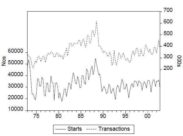
The apparently fairly stable relationship between new-build and total sales in the market has fascinated me for some while. Good data are hard to come by but there does appear to be a fairly stable relationship of new sales to total sales in England of about 1 in 10.
This appears to be the aggregate of fairly stable (although less stable than at national level) regional ratios which do differ one from the other. Data on sales of new and second-hand homes provide by Hometrack over the past few years suggest, not unexpectedly, that each region may have its own broad ratio of new to second-hand sales. For instance, in London the figure over the past decade comes out at about 1 in 14. Meanwhile in the North East and the East Midlands the figure comes out nearer 1 in 8.
There is little hard research to suggest or answer what if any causal link there might be. In his paper Prof Meen offers no definitive answer for the link between starts and housing turnover, but he suggests it may be that: “In order to avoid financial constraints, they [house builders] wish to avoid a build-up of stocks of unsold dwellings and market turnover is a good indicator.”
Whatever might lie behind it, the graphs show that since the late 1970s there has been a strong relationship between housing transactions and both starts and completions.
On the figures for the graph below I have the simple correlation between completions and transaction somce 1978 comes out at about 0.8. (Many thanks to Richard Donnell of Hometrack for providing me with a consistent series on residential transactions as well as the data on new and second-hand home sales, the completions data are from DCLG)
If we have suppressed transactions for some time hence, we should not be surprised to see similarly suppressed levels of private sector house building.
Unless something alters – say a sharp fall in house prices or some new forms of purchase arrangement are introduced – that reduces the burden restricting new homebuyers, we should be prepared for a long spell of low levels of residential property transactions.
And that points to a long spell of low levels of house building.
So, if the ippr’s figures for demand hold anywhere near true, we may find the gap between “demand” and “supply” growing far more steeply than its already worrying predictions suggest.
Appendix
Below I have taken a series of districts pretty randomly and looked at pay, median house prices and the proportion of take home pay plus child benefit would be consumed by servicing the interest on 100% of the house price. No account is taken of repayment. The Bath & North East Somerset figures provide an example of where particularly high prices exclude most people working in the district from access to the housing market.
I have included figures for a “what if?” our median family were paying 7% in 2009 to illustrate the pressure that would come onto household incomes.
| Median weekly earnings | Take home pay plus child benefit | Median house price | Interest payments as proportion of net income | |
| 2000 mortgage rate 7.09% | ||||
| South Tyneside | 366 | 305 | 46,975 | 21 |
| Carlisle | 351 | 301 | 52,500 | 24 |
| Ipswich | 357 | 302 | 65,000 | 29 |
| Gloucester | 395 | 330 | 66,500 | 27 |
| Bath & N E Somerset | 357 | 302 | 110,000 | 50 |
| 2007 mortgage rate 5.79% | ||||
| South Tyneside | 388 | 368 | 115,000 | 35 |
| Carlisle | 475 | 399 | 125,000 | 35 |
| Ipswich | 503 | 416 | 143,000 | 38 |
| Gloucester | 531 | 472 | 157,500 | 37 |
| Bath & N E Somerset | 503 | 416 | 230,000 | 62 |
| 2009 mortgage rate 3.71% | ||||
| South Tyneside | 463 | 425 | 112,000 | 18 |
| Carlisle | 471 | 428 | 122,000 | 19 |
| Ipswich | 540 | 453 | 122,000 | 18 |
| Gloucester | 567 | 472 | 139,995 | 20 |
| Bath & N E Somerset | 519 | 442 | 205,000 | 32 |
| 2009 mortgage rate of 7% | ||||
| South Tyneside | 463 | 425 | 112,000 | 35 |
| Carlisle | 471 | 428 | 122,000 | 38 |
| Ipswich | 540 | 453 | 122,000 | 36 |
| Gloucester | 567 | 472 | 139,995 | 40 |
| Bath & N E Somerset | 519 | 442 | 205,000 | 62 |
2 thoughts on “Are we condemned to low levels of house building?”
Some very well reasoned analysis, and the link between general stock turnover and new build completions seems hard to refute.
However, is the use of a ‘single’ (i.e. non household) median income and median house prices an appropriate methodology to assess affordability?
When looking at FTB’s surely more reasonable to assume both a (higher) joint income, and a lower entry level purchase price?
Mortgage deposit issues aside, the impetus for households to become homeowners is likely to be pronounced where local market conditions make purchase more affordable than renting, so even if prices remain high, if rents also continue to increase demand for purchase will also.
Una Planner, Many thanks for the comment.
You are rigth a single-earner family is probably not a suitable methodology to assess affordability. It is far more complicated than that, as I appreciate you understand in posing the question.
But for the purposes of what I was seeking to illustrate it didn’t really matter that much what household unit one picks, so long as it is consistent and reasonably realistic. The aim in my mind was to look at the impact on an example over time as interest rates and house prices shift.
But the choice was deliberate. I wished to “rattle the cage” a little by picking a single-earner family.
There is abroad a view that FTBs – almost as a right of passage – have to leaverage themselves to the full to hoist themselves on to the first rung of the property ladder.
That is probably acceptable in a high wage inflation environment, which those in the late 40s and 50s will have probably have experienced. It is less so in a low wage inflation environment, where debt burns out far more slowly.
One question I was hoping to provoke in picking the example was – given that FTBs are increasingly in their 30s – what about those planning to start a family?
I was, in part to amuse myself, looking to challenge what has become the sterotype of normal entry into homeownership, which is the above average earners with joint incomes no kids example. But where the joint earnings are not well balanced it is not unreasonable to assume that, when the child care costs are taken into account and extended family are not at hand, it may prove more suitable for many families that one parent stays at home.
At today’s super low interest rates most people could probably afford to buy a home if someone leant them the money. The question I was teasing with the atypical FTB example was what level of personal cost is it reasonable for young people to accept in the longer run and what is socially acceptable?
With regard to the rent issue, yes local conditions will vary and vary widely. But nationally it is hard not to suspect that open market rents are likely to come under pressure as income comes under pressure.
There will be limits to what any family or person is willing to pay for housing consumption. And as prices rise they will seek to consume less – move to a cheaper part of town, live in a smaller home, stay at the parental home etc. In effect the reverse of what we have seen over most of the past half a century – on average that is.
But you know as I know, the national average is not necessarily totally reflective of the reality.
Once again many thanks for the comments.
Comments are closed.