Reasons to be cheerful as the official construction figures show output dropping
The latest official data seem to provide yet more evidence of the decline in construction output, although the picture may not be as bleak – yet – as the published figures suggest if taken at face value.
You shouldn’t really read too much into one month’s figures anyway in an industry that can be highly volatile and that is going through a particularly volatile phase. But people will and I am obliged to do it for a living.
That said you can probably argue with some confidence that the figures continue to show that it is increasing housing and infrastructure work that is currently propping up the industry’s overall output. Most other things are in decline.
 The data also suggest yet again that hopes of an early rally in the commercial sector might be a bit premature if not misplaced.
Meanwhile, they show the increasing pace of decline in the public sector spending, which in fairness took a bit longer to feed through than many expected.
But trying to say too much more is rather stretching things.
There is of course a further reason to be cautious with interpreting these figures. This data will be revised and, for technical reasons I’ll not bother you with, these revisions will be almost certainly upward.
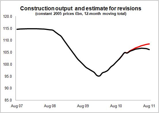
So what I have done is to produce a graph from the constant price data series on a rolling 12-month total basis. I have fudged this a bit with the pre-2010 data which does not appear on a monthly basis, by splitting the quarterly data into equal months. This doesn’t alter the story it just saves me a bit of bother.
The annualising provides a crude seasonal adjustment to give a better clue to the direction the industry is taking, albeit rather delayed.
I have created a second series by grafting on guesstimates for the future revisions to the data over the next 13 months. To get the estimate I have looked back at previous monthly revisions – leaving aside the rebasing which occurred to the June figures – and sought to assess a crude average revision for each month.
As you can see from the graph revisions (if they broadly follow the historic pattern) would change the picture quite markedly.
It is quite possible that we may, when all the revisions are made, end up with a series that shows construction continuing on a growth phase in August as opposed to a decline, as the figures currently show.
All very crude and it would be wrong to suggest that the future revisions will follow the estimate, but hopefully this illustrate one reason to be a bit cautious about instant interpretation of the construction figures as they are currently set up.
But if you are pinning your hope on revisions to the data to make the construction world look like a better place, now that would be clutching at straws.