5 reasons why we might be facing the mother of all construction recessions
It’s coming around to the construction forecasting season again and the industry prognosticators will be gathering to discuss the ups and downs of the industry.
If I were you, I’d be bracing myself for some pretty savage revisions to what already look like pretty savage forecasts.
Peak to trough in the 90’s recession we saw a drop in volume terms of 14% in workload. In the 1980s recession it was 16% and in the 1970s it was 20%, according to the 2005 constant price output data.
Who knows how deep this recession will be for construction, but I wouldn’t rule out the possibility that this recession could eclipse all of those. Don’t be shocked if you see a forecast suggesting a 25% drop.
What has made me that pessimistic?
Firstly and wisely, I don’t do forecasting. But I do like to assess how the figures might change and what the mood is among the forecasters, so I chat to a few people. And this time around that was where it all went wrong.
It was during a chat with Noble Francis at the Construction Products Association that I felt myself being encouraged to follow up on a thought I’d mentioned in our conversation.
I’d mentioned that the decline in the housing and commercial construction sectors are much closer in time than they were in the 90’s recession and wondered what impact this might have on the shape of the downturn. Theoretically it would make it faster and potentially deeper. “So you are going to blog on that?” he suggested.
That is how I ended up wasting away some hours last night with numbers and graphs testing out a few ideas. Foolishly my playing with numbers and pondering didn’t stop with the phasing of housing and commercial work.
Just think I could have been more usefully engaged watching Terminator 2: Judgement Day on ITV 2 and it would have been less apocalyptic.
Still here are five reasons that occur to me that suggest we may be facing a much worse recession than any since 1955 when current records begin.
POINT 1: In-phase biorhythms accentuate the highs and lows
Think of each sector as one of a series of biorhythms which together determine the overall wellbeing of the industry. Normally they will be phased so that they smooth peaks and troughs a little. But events such as the credit crunch can change that.
Graph 1 shows the path of housing output (I have included all housing, as the distinction between public and private is blurring), commercial output and all construction output for the 90s recession and the current recession. The bottom axis measures quarters either side of peak construction output. All the figures are adjusted with the peak set at 100.
GRAPH 1
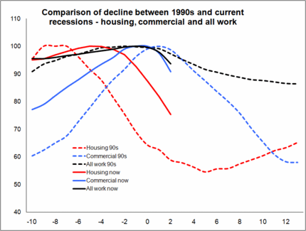
All the graphs follow a similar style with zero marking the peak quarter.
It is clear that the peaks of housing and commercial are far closer together this time around and this is dragging down all output more rapidly.
POINT 2: Strapped for cash, cut back on maintenance
Graph 2 shows the two private RMI (repair, maintenance and improvement) sectors in a similar fashion to the housing and commercial sectors in graph 1.
GRAPH 2
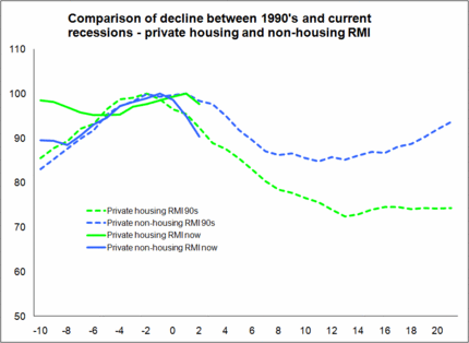
What is interesting in that private housing appears to have held up better this time around and for longer than in the 1990s.
Now while I am sceptical about these figures, I think it fair to assume we will see a sharp decline from now on in this sector, most likely faster than in the 1990s.
Further, with reducing debt expected to be a major feature of the years ahead it seems reasonable to assume that “doing up your house” may drop down the agenda and this will probably restrain any recovery.
On the non-residential side it would appear that companies are already drastically cutting back on spending on RMI work. This points, on the data as it stands, to a worse outcome than in the 1990s.
GRAPH 3
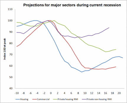
Back on the biorhythm theme, what I have done with graph 3 is project forward the path of this recession for each sector on the assumption they followed the path of the last. It’s crude I know, but what you see are four of the major sectors (predominantly private sector driven) all going down in a short space of time.
GRAPH 4
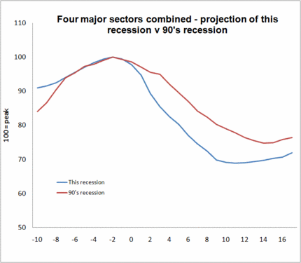
And in graph 4 I have aggregated those figures together and compared the path with the equivalent path in the 1990s. What we see is a 31% drop much earlier than the 25% drop that actually happened in the 1990s.
Point 3: Where’s the boom in civils this time around?
There will be some compensating factors and a boost to civils looks favourite.
In the early 1990s there was a huge boost to infrastructure spending over the period of the recession. That is obvious from graph 5, where I have based to 100 the level of output for the sectors when overall construction output peaked.
The Channel Tunnel and the roads programme helped to keep civils spending on a high in the early 1990s, compensating in part for the flagging building sector.
GRAPH 5
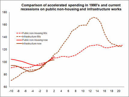
While civils may do better than building, it is unlikely to compensate overall construction output on anything like the same scale as it did in the 1990s. And as we discuss below we also saw a constant rise in spending on public non-housing new building work through the 1990s recession.
So it seems fair to expect less to fill the gaping hole left in the building workload.
POINT 4: When public spending falls of a cliff, then what?Graph 5 also shows the growth in public sector spending on non-housing building work. Throughout the 1990s recession this output expanded solidly. Well it may do for a while in this recession, but expect a sudden reversal just as the housing and commercial sectors have pulled output down to a low.
The elephant that has been wandering around the rooms in the Treasury unnoticed tells me to expect massive cuts before the private sector stabilises.
POINT 5: It’s a much higher cliff, so it’s a much bigger fall
What the graph doesn’t show is the relative level of public spending on non-housing building work. It also can’t show the impact of reduced public spending on leveraging private financed projects.
What we do know is that the public sector accounts for significantly more of the construction output than in the 1990s. Taking just the public non-housing new building work, when the recession hit construction this time around output in the sector was 60% more than when recession bit in the 1990s.
Taking the above 5 points together that is how I got so pessimistic.
It’s amazing what you can do with graphs and numbers. Apart from wasting a huge amount of time you can make almost any future scenario look reasonable.
Still, we’ll see.
The good news is that there is such a wide range of possible outcomes, so I could be wildly wrong.