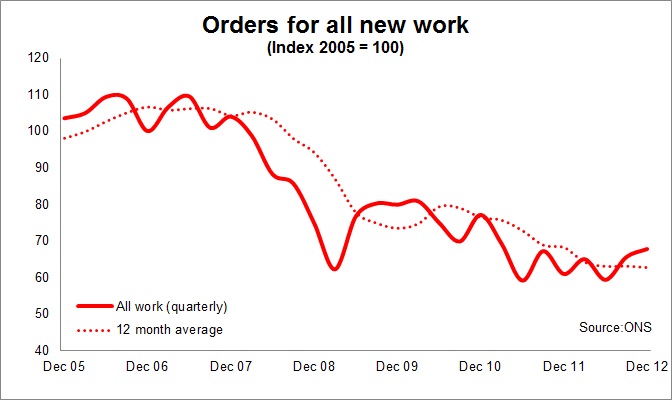
Rise in new orders provides some solace, but they remain at very low levels
The latest construction new orders figures will give some solace to some. The need to see growth, any growth, in any construction indicator is desperate.
The top graph shows clearly how new orders for construction have fallen over the past few years and how frighteningly low the level remains.

I remain a shade concerned over the accuracy of this data series just because it does look so terrible and the implications the figures have for construction output – that which actually pays people – are disturbing.
One thing to note about orders is that they do not track with output in any direct way. The measure is more akin to how much the tank is being filled by rather than how much fuel is passing through the carburettor or fuel injection system.
If your tank is full then you can go with putting less in than you use for some while. But sooner or later you have to have a serious refill. That is what the industry has been lacking for some long while. Orders books are being diminished as the big orders let late last decade come to an end.
Leaving all that to one side, the implications of the latest data is that while there are signs of improvement the need for much greater improvement is clear from the graphs above and below.
For me the most concerning graph is that which shows the level of private sector work. This is where we need to be seeing most growth to compensate for the reduction in public spending.
Yes we are seeing a bit of a rise in house building. But overall as the graph shows this is minor when looked at in the bigger picture.
And there are early signs that in some regions, notably the North West, things may be perking up a bit.
But the latest figures, when fully considered, do support the forecasters view that in the short term we have as an industry further to fall.
Anyway I will leave you with a series of graphs and you can make up your own mind on whether the recent upswing in orders is anything to break into song about.
