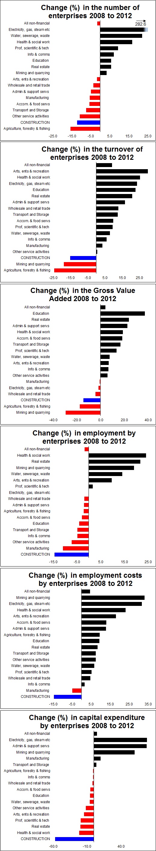
Six graphs showing the pain suffered by construction firms from 2008 to 2012
Recessions are gruesome and unfair things. They do not strike evenly and that is plain to see in this selection of graphs drawn from data the provisional results of the Annual Business Survey 2012, released today.
Readers should use caution and note that these are figures taken from businesses. They do not necessarily reflect the actual performance of the industries as a whole, as for instance the turnover data are not consolidated. So it will reflect, for instance, intertrading among firms within any given sector. The proportion of intertrading may have risen or fallen in response to a recession or some other trend.
Also taking 2008 and 2012 may not necessarily be provide a result that is fully representative of the overall trend.
But accepting these caveats, the graphs as a whole pretty clearly show how much harder hit construction was than other sectors over the years 2008 to 2012.
All the data are from the ONS survey.