The ever changing shape of housing tenure in England
I’ve updated some of the graphs I used in a piece I co-wrote for the Housing Market Intelligence 2012 report to take account of the latest English Housing Survey data.
Hopefully the graphs are pretty self explanatory.
The data is taken from previous English Housing Surveys, its predecessor the Survey of English Housing and from the DCLG website. There are some gaps in the data and dotted lines join these gaps. The dates refer to the previous calendar year, so 2011-12 becomes 2011.
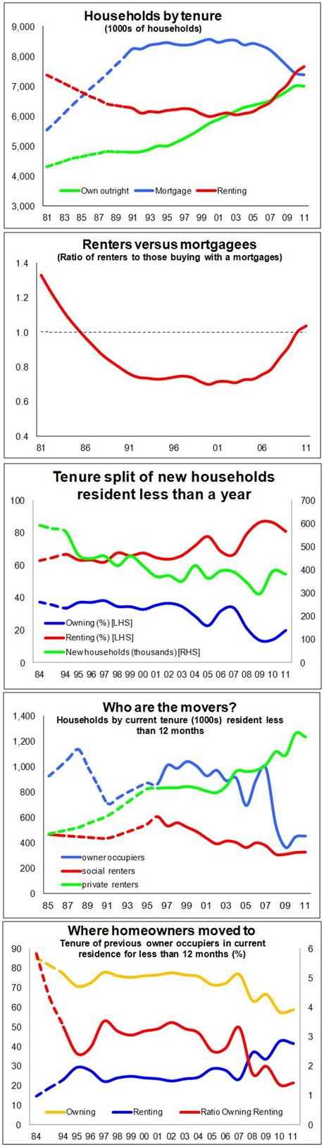 My take is that the latest data clearly show the ever rising rental sector, driven by the private sector.
And, given that the survey suggests a slight fall in social renting along with outright ownership and owning with a mortgage, this means the private rental sector is the only one growing at the moment.
The figures suggest a rise of more than 200,000 in the number of households renting privately over the year to March 2012. This has made the private rented sector larger than the social rented sector for the first time since the 1960s.
Meanwhile, for the first time since 1995 we have seen a fall in the numbers who own their homes outright.
Since the peak in 2000 the numbers of households buying with a mortgage has fallen by almost 1.2 million. So among those who have to stump up each month for housing, renters now clearly outstrip those buying with a mortgage.
If there is one positive sign for those selling homes it is that the proportion of new households formed moving straight into owner occupation has risen.
But still more than 80% of new households move into rented housing, compared with about two thirds in the 1990s.
And when we look at who moves house it is still very much dominated by the private rental sector.
We are also continuing to see a large slice of owner occupiers choosing to move into rented housing. In the 1980s more than 80% of owner occupiers stayed in the sector when they moved. That figure has dropped to below 60%.
So what is the English Housing Survey telling us?
That the housing market remains very different to what it was in the latter parts of the previous century.
What is also pretty clear from these graphs is that much of the trend we see so clearly now had its roots planted well before the credit crunch and the subsequent recession.