Why the latest orders figures are so disturbing
The latest official data for new orders in construction could be read as good news. They show an up-tick of almost 5% in the first quarter of this year on the seasonally adjusted measure.
That sounds promising on the face of it and many might claim that it is. But that would be to look at a small detail in a much bigger picture that looks far from promising.
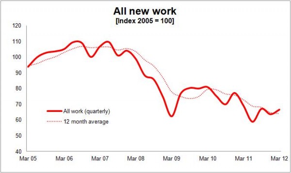 Naturally any rise in new orders at the moment is welcome. But the rise in the first quarter was not enough to stop the annualised volume of new orders falling to the lowest level yet seen in this recession.
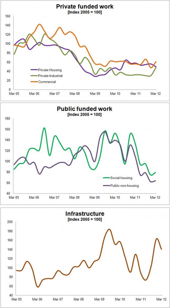
What is of particular concern is that the new orders for private housing and commercial work (see graphs below) are so poor. Given the spending cuts, the private sector needs to be fired up if construction is to return to growth and restore some of the ground it has lost over the past four years.
Taken neat these are truly awful figures and have been worrying for some time.
Before drawing too many conclusions from the data, it is important not to think that orders directly relate to output. Think rather of new orders as the amount you put into the tank each month and new work output as the amount you use. It’s not quite that simple, because work is negotiated or done outside that which is recorded in the contract data. But the notion of stock and flows needs to be appreciated.
Still, whatever caveats we might put on these data, they suggest new work being won by the industry is at a level last seen in the 1980s, when frankly construction was on its backside having had the rug pulled from under it when public spending was savagely cut as the nation went into recession.
Sound familiar?
The good news – and in stark contrast to the late 1970s – is that when the industry entered recession in 2008 the tank was brimming and there were a few full jerry cans stocked up as well.
The bad news is that since then the volume of new orders taken in each month has dwindled to levels not seen since those best-forgotten grim old days of the early 1980s.
Now you might be cute enough to think that there are issues with the deflators or seasonal adjustments in the figures. But strip these out and we see that in cash terms the level of new orders won over the past year is at about the same level as a decade ago.
Now the price of an average basket of goods and services has risen by about a third since 2002, so that rather puts into perspective the 5% rise in the seasonally and inflation adjusted estimate of new orders.
But more important than the growth rate and even the level is that new orders have been so low for so long. If we look at the work let over the past four years it is down by almost 30% on the work won in the four years up to the credit crunch in the autumn of 2007.
This compares interestingly with just 8% less construction output over the past four years compared with the four years before the credit crunch. It suggests that new orders in the tank, so to speak, are being used up far faster than they are being replaced.
One crumb of comfort is that in reality the large disparity suggested by these figures between the drop from peak in new orders and the far smaller drop in output is probably a bit less worrying than it looks.
One of the reasons that the orders were so high ahead of the credit crunch was that the mix of contracts was changing to include unusually large proportions of big contracts. In 2009 the top 50 contracts accounted for 32% of orders greater than £100,000, whereas the corresponding figure for 2003 was 19%.
Being larger, these contracts will have on average provided work for longer periods and fortunately this will have helped to support work on site through the recession. So the orders figures contained work that stretched far further into the future than would normally be the case.
Also developers shelved a large number of schemes in the wake of the financial crisis. This probably reduced the peak of construction to less than the orders figures might have suggested. Much of this work did come back and overall the effect would have been to smooth out workload and help to support the sector through the grim times.
The scale of the recession was also eased by the previous Government bringing forward public capital spending and creating a surge in the value of public sector orders let in 2009 and 2010.
Thought of in graphic terms the peak of orders was higher than one might normally expect and the peak in output lower, given the level of orders in the pipeline. So we might reasonably expect a lower corresponding fall in output than we have seen in orders.
The effect of more large projects, stalled schemes and a public spending surge mentioned above might in part explain the rather odd divergence between new orders and new work output through the recession, which is evident in the graph below.
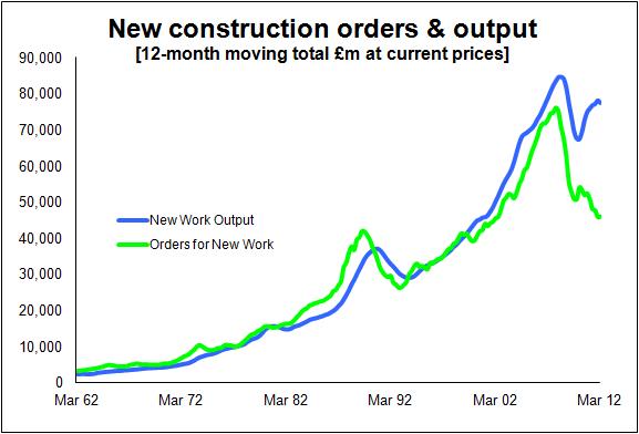 Ultimately, however, as the graph immediately above shows, new orders are – or at least up to the recession were – a very strong indicator of future work. There is a very close correlation.
So, despite the weakening of that correlation recently, unless something has dramatically changed in how the industry’s procurement operates or there’s a cock up in how the data are collected, we should expect to see output come back a bit more into line with orders.
Sadly, given new orders are still in decline on an annualised basis and we are pretty much running on empty, we shouldn’t be shocked if new work output falls substantially.
How much? That’s a tricky question to answer, but these data worry me plenty.
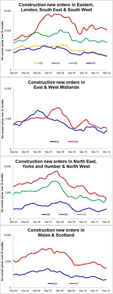
Anyway, here are some sector and regional graphs to provide food for thought and to make the blog a bit more colourful.