Output data add to worries over private sector weakness as public sector cuts hit workloads
The latest output figures released by the Office for National Statistics on Friday appear to support growing concerns that the decline in construction workload might be accelerating.
Analysis of the data suggests that as the decline in public sector work is gathering pace the recovery in the private sector is petering out.
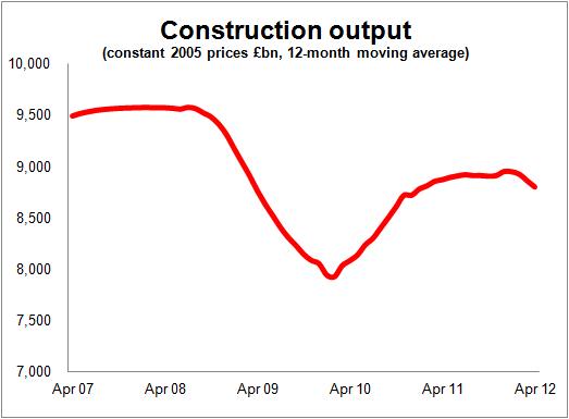 The top graph showing the 12-month moving average of output for all work (seasonally adjusted) to April illustrates how workload is falling.
While many within the industry have been concerned for some time, the weakness in the construction sector became very apparent to a wide audience last month when the first quarter data were released.
This came as a wake-up call for many economists and policy makers. It showed a drop of 4.8% in the first quarter and was largely responsible for pulling the nation into recession. The latest release has revised that fall to 4.9%.
This wasn’t what many outside the construction industry were expecting. They had been reading business surveys telling them that construction was in fine fettle.
For the record and for the pedantic, it is probably worth saying that a point not much picked up last month was that – on the technical definition of two quarters of negative growth – construction is not actually in recession.
On the seasonally adjusted volume measure, output in the final quarter of last year was, last month, revised up from -0.2% to +0.1%. That figure now stands at zero following the latest revisions, which still means technically that construction isn’t in recession.
But that detail is of little real consequence. The die is cast and construction growth is very negative.
The data for output to April show output falling 13.2% in cash terms. You might expect a fall of about this size based on past data and as a result of the normal surge in work in March. More importantly (and more worryingly) output was lower in cash terms than it was in April 2011 by 8.5%.
It would be silly to read too much into one month’s data, which may of course be revised up. But, given that the trend is downward, this figure is not welcome news. And once again we failed to see signs in the figures of a pickup in activity in the private sector.
It is probably worth pulling some of the output data apart and examining what’s going on.
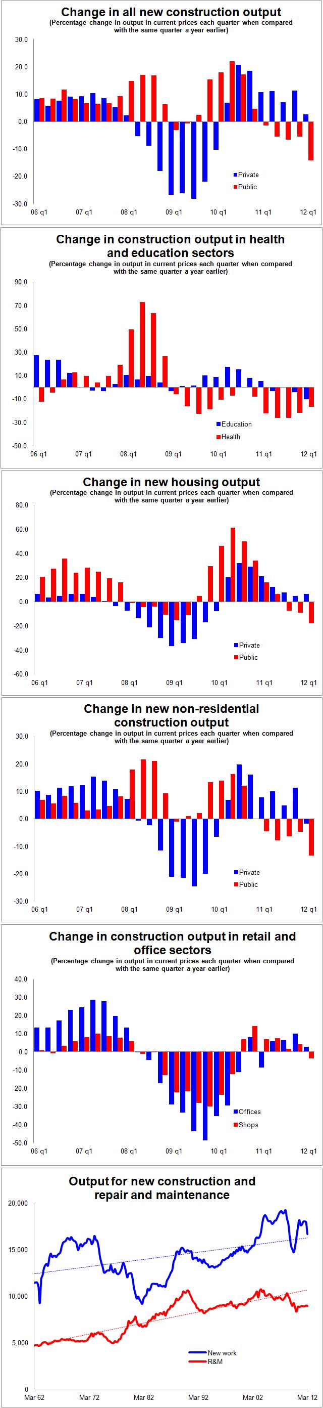
I have put together a series of graphs (see below) from the ONS construction output data that compare each quarter with the same quarter a year earlier. This should take out most seasonal variations.
They are in cash terms so do not take account of inflation, so they will tend to paint a more flattering picture of the underlying trend in volumes of late, as construction inflation is thought to be running at about 3.5%.
The first graph in this series shows output of all new construction (not repair and maintenance) split by private and public sector. The split between private and public is not perfect as it is confused by the PFI. To account for this I have considered the education and health listed under private commercial as public sector work.
It’s not perfect, there will be other anomalies, but it’ll do.
This very clearly illustrates how the public sector was mildly impacted by the recession and how in late 2009 public work bounced back to provide strong growth for the industry.
The graph also neatly illustrates how the private sector work recovered strongly, but later, as the economy perked up and (as we will see later) house builders restocked their production pipelines.
Unfortunately what we now see is the expected rapid decline in public sector output and a very unsettling fall in the growth in private sector output in cash terms to a rate below inflation.
What had been the hot spots of public sector procurement, health and education, are now both in recession and the rate of decline is accelerating (see second graph in the series).
The hardest hit of the major sectors was private house building. The third graph in the series shows how within housing the deep decline in private housing dragged public house building down with it. This was to be expected as on many scheme the sectors were interwoven.
But a huge surge in public funding saw a strong revival in building social sector housing. And as the recovery in the economy took hold in late 2009 the private sector began to bounce back. This however was in large part down to the restocking of a production pipeline which was brought to drought levels when builders, during the recession, focused on finishing off and selling existing stock rather than starting up new sites.
This restocking phase has passed and what we see now is a growth rate not much more than the rate of inflation in the private sector, with a rapidly accelerating decline in social sector house building.
What this graph does not show is the regional variation, which will be great. The focus of house builders has been very much on London and the South East.
When we strip out the housing element from the new construction output figures what we see is public works falling away and a stuttering private sector (see fourth graph in the series).
Looking at two of the big subsectors in commercial building, shops and offices, we see a very scratchy recovery from a deep recession that appears, looking at the latest data, to be petering out (see fifth graph).
All this is pretty depresing, but we have so far focused on new construction work. This does seem to be very vulnerable and certainly the orders data support the view that things could get very nasty in the coming months.
The data for the repair and maintenance sector, however, doesn’t look nearly as alarming. Yes, repair and maintenance work has declined from peak about the same amount as has new work. But both the data and history suggest that the sector will remain more stable than the new work sector.
The final graph shows the new work and repair and maintenance sectors over the past 50 years. There may be issues with the data, given that the ONS have spliced two series together, but what we see is that construction output from repair and maintenance work does tend to follow more closely its historic trend (dotted line).
It would seem – and this can only be speculation – that in general terms repair and maintenance work offers more promise than new build in what looks like an increasingly gloomy market.
One thought on “Output data add to worries over private sector weakness as public sector cuts hit workloads”
When you remember what the weather was like in April 2012, is it any surprise that construction output showed such a large drop.
I would predict that May’s output number will show a big rise, due to the weather being better and firms catching up on the poor weather in April, but June’s number will show a fall, again the weather plus the extra holiday due to the Jubilee celebrations.
Yes, the overall trend is down, and will get worse but do not read too much into one or two months’ data.
Comments are closed.