Here’s what bothers me about inflation – for what it’s worth
The latest inflation figures show the growth in consumer prices remaining stubbornly high. The CPI index stuck at 4.5% up on a year ago while the RPI measure remained at 5.2%.
These are extraordinary figures given that it wasn’t that long ago that fears were being expressed about deflation.
But the figures are not that surprising to some. There have been voices suggesting inflationary pressures were far higher than the assessments made by most expert forecasters and the Bank of England.
Looking back over past blogs I’ve banged on about the threat of inflation ever since this blog started three years ago. And I’ve been perplexed by the appalling forecasting by those who are far better tutored in these matters than I am. Here’s just one example.
You could almost think there was a conspiracy. And in odd moments I think that if the policy makers behind their public rhetoric really do want higher inflation to burn out the appalling overhang of debt (and I have no evidence that they do) they should have the decency to come clean.
It is a legitimate tool. Yes, the international markets might react badly. And, more importantly perhaps, it raises moral and moral hazard issues in that it penalises the prudent saver to spare flagrant debtors and potentially their reckless lenders excessive pain.
But it can work.
Leaving all that to one side, what bothers me more is the shape that inflation is taking. And the latest figures have not eased my concerns.
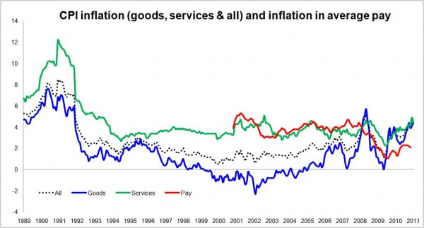
The graph above in large part illustrates my worries. It charts the path of goods and services inflation.
What we note is that inflation in goods in general tracks below services. Now I don’t want to get too bogged down here about the distinctions or suggest these two elements of inflation can be treated totally separately, but there will be a number of reasons for this divergence in the rate of inflation.
Using a broad brush approach we can say that among the reasons for goods getting relatively cheaper are that it is easier to make productivity improvements to goods through innovation and also we can more easily substitute expensively made goods at home for less expensively made goods from abroad.
International trade in services is possible and happens increasingly, but most services tend to be done close to or at the point of use by people living nearby who want pay rises each year.
Innovation in processes and such things as IT can and does raise services productivity. But there are many services – particularly care services – that require fixed levels of staffing and, also, improved regulation, to ensure standards of care etc, would also tend to restrict the downward pressure on the cost of services.
I am not sure how well production-line massages or pedicures would sell in the indulgence market.
One effect of this disparity in the rate of inflation is that over time services have taken up a larger proportion of our notional shopping baskets. So in 1988 goods accounted for 71% of the stuff in the notional basket, whereas now they account for 56%.
What is also interesting, if not totally surprising, is the relationship between pay and inflation in services. I have plotted on the graph an index of pay growth (seasonally adjusted regular year-on-year pay growth averaged over three months). What we see is that, before the obligatory pay cuts for many, it tracked very closely to services inflation.
With services inflation above general inflation, this means that over many years pay has of necessity outstripped overall inflation, when we use these measures. This is nice and makes us – on average – feel richer.
Now let’s look at the decade 1996 to 2006. We see a rapid separation in goods and services inflation – the “China effect” as some might call it.
Things really began to feel cheaper and much cheaper relative to our rising earnings.
Well looking at the graph all that has changed.
Indeed we have seen goods inflation rise above services inflation for the first time in the period that this series has run.
Now you can talk about short-term price shocks and there have been some, as one would expect in the recovery from the kind of global economic shudder we have suffered. Meanwhile the UK has seen the buying power of the Pound fall making imported goods more expensive.
But the rise in goods inflation pre-dates the credit crunch and the fall in the value of the Pound.
So, to me at least, it does not seem such a stretch of the imagination to speculate that goods inflation is pretty likely to remain on balance more positive and more erratic than during the more sedate period to 2006.
In which case, it seems reasonable to be wary of the potential for goods inflation to be strongly positive in relation to the Bank of England target – although there are plenty of variables that might lead to an alternative future.
But if the overall target is to be met within an environment of higher goods inflation it will mean the Bank of England keeping a tighter check on the services element inflation. This in turn will translate, as things stand, into tighter control over wage inflation, which will limit real wage growth.
As we see from the graph, on the measures I have selected, pay is lagging inflation so people are already seeing negative real wage growth.
To bring this back to construction, this is not good for the private housing market which has boomed on the back of real wage growth.
Rising earnings is one of the few ways that the fundamental relationship – if you see it that way – between house prices and earnings can be realigned and it is highly likely – in my view – that without that realignment we face continued low levels of transactions. Unless, that is, we can guarantee low mortgage rates and high loan-to-value deals.
But there is a further worry when we look at this graph. During the period when there was a disinflationary effect from importing ever more cheaper goods, interest rates had to be lower than would otherwise be the case to help keep inflation up to target.
As recovery comes, as it will, will workers baulk against tight constraints on their earnings? If so, will the Bank of England be obliged to apply its interest rate tool more heavily?
Could we possibly be entering an era of low wage rises and higher interest rates?
That certainly would present a challenge to those looking for a sustained and significant recovery in house building through the private sector.
Now plenty of things could change to improve the situation here. We could expand our exports of top-end services or increase exports of high-value added goods and so increasing the proportion of better paid jobs.
But this graph just leaves me with unease and a sense that it is going to be hellishly tough from where we find ourselves now.