Finding smiley faces in the wallpaper – a look at today’s house building data
What can be said of the latest (second quarter) house building statistics that we don’t already really know, or suspect we know? Probably not a lot.
The chances are they tell us more about the things we are likely to forget or ignore.
Let’s look at the statistics for house building in England. Starts were well up, a bumper 37% (not seasonally adjusted) comparing 2013Q2 with 2012Q2. But this is comparing a relatively event-free sun-baked quarter with a rain-sodden Jubilympics distracted quarter a year ago. Not a surprise that starts were particularly low a year ago.
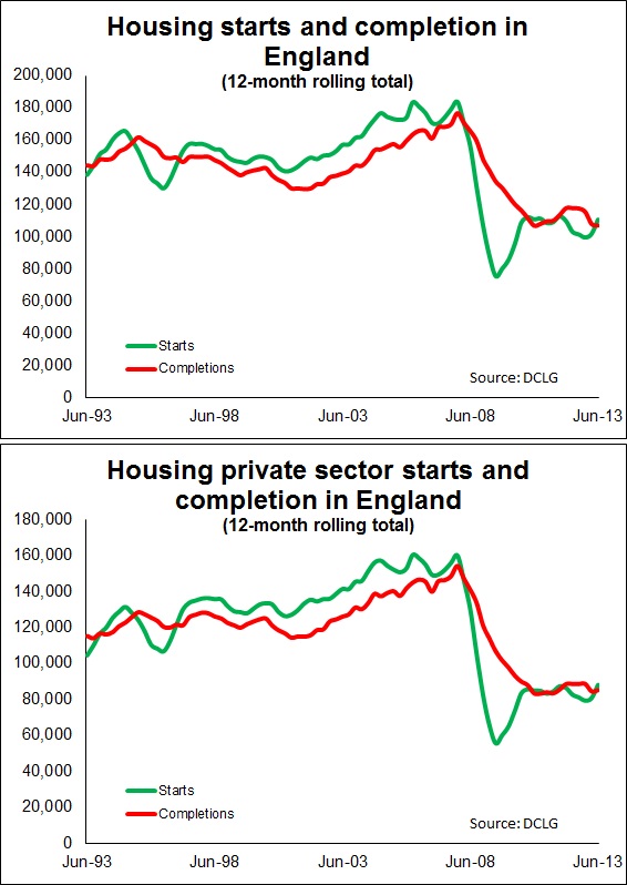
This distorts the stats in a number of ways, not just the quarterly comparison, but the 12-month moving total also leaps as we see from the graphs.
 The other problem with looking at starts is the drivers of starts are more complex than you might think. Yes they respond to expected demand, but they also are related to the level of existing activity and what’s in the pipeline. You have to look at stock as well as flow.
However, trusting in the statisticians at the communities department and using the seasonally adjusted figures there is a hint that the starts, especially private sector starts, are on the rise. And given the hype about at the moment you’d really have expected that.
Turning to the completions and first looking at the seasonally adjusted data. There does seem to have been a bit of a leap in the second quarter. But the problem is that the first quarter was awful. How much of this is a bounce back and how much a genuine turn of the corner is hard to decipher.
This seemingly disappointing start to 2013 was, it must be said, more acute in the social sector where we are seeing a big drop in completions.
But again there are problems when interpreting this data. Is it bad?
House builders can’t just switch on supply to respond to demand and produce new homes in a jiffy. It all takes time.
So while it is easy to read into the figures a turning point in house building in England and there probably is one, the data really don’t support it. But it certainly doesn’t suggest the opposite. And yes you can see signs in the data of an upturn if you look hard at the data or the graphs.
Mind you, you can see faces in the patterns of wallpaper if you stare long enough.
For me the graphs illustrate a major issue. The level of house building is pretty flat and more importantly at a very low level. A percentage increase may sound impressive, but 10% or half is just 5% of the whole.
Frankly the big message is that we are not building enough homes and haven’t been for far too long during this recession. In the 12 months to June we completed 106,830 homes in England according to these figures against a peak of 176,610 reached at the end of 2007.
We need a major boost that will be very evident in this data series if we are to pull ourselves back to the levels of house building the nation deserves.
That is what we should not ignore. So until next quarter…