Halifax figures dampen hopes of spring bounce in house prices
The Nationwide figures published yesterday provided some cheer for those selling homes with the announcement of a 0.9% rise in its house price index for March.
That hope has been rather squashed with the Halifax today releasing figures suggesting the price of an average home fell in the month by 1.9%.
What does it all mean?
As suggested when commenting on the Nationwide figures, it is reasonable to expect the various indexes to bobble around a bit at the moment, because there are likely to be some positive signs even in this broadly grim market as the economic medicine takes effect.
Added to this there is reduced statistical reliability in the market at present because there are fewer transactions, which will lead to more skittish data.
Also it is a rather bizarre market with the relative situations of the buyer and seller playing a huge part in the price, rather than simply the location being the major factor in the sale price. This will add to the erratic nature of the data.
So if I were a seller I wouldn’t read hope into one month’s Nationwide figures and equally I wouldn’t read desperation into the Halifax data.
But it is worth reiterating that the risks are heavily on the down side, however optimistic we may feel after the G20 shindig.
I noted that Julian Birch blogging for Inside Housing smartly picked up the fact that the Nationwide HPI is below trend for the first time in 7 years. His point is that prices tend to pass the trend line on the way down.
This is true. But there is a further point worth making that is often missed – as prices fall so does the trend line (leverage – I believe they call it, but I am open to correction here).
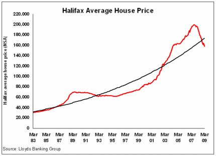
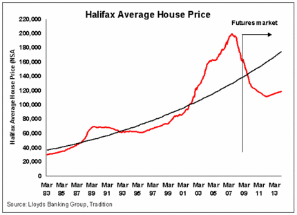
I have put together a couple of graphs to illustrate the point and to show just how bad things could get without them appearing unrealistic when you look at the graph.
The first graph shows the figures to date with a trend line (I simply used the power option for the trendline in Microsoft excel, although I am sure there are fancier ways of doing it).
The second graph adds in data provided by Tradition Futures HPI, which show how traders are pricing in the futures market. Again I have added a trend line.
The point of note is just how far that trend line falls when you add in the futures data and how reasonable the graph looks – if you can get over how scary it must look to someone selling homes.

